Brat Green: The Truth Behind Charli XCX’s Eye-Catching Shade and Its Summer Takeover
When we think of the summer of 2024, one color might come to mind—a vivid, almost toxic green that made a splash. This eye-catching hue, nicknamed “Brat Green,” owes its sudden fame to Charli XCX’s album Brat. But before you get swept up in the buzz, let’s sift through the facts and separate what’s true from what’s just hype.
The Reality of Brat Green: Not Just a Gimmick
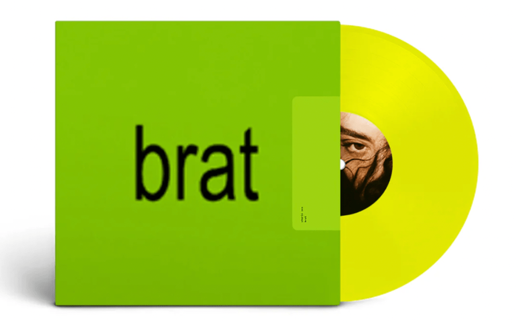
Charli XCX is known for pushing boundaries, and the cover of Brat is no exception. Featuring a jarring green backdrop with four blurred letters, the album artwork is a bold deviation from conventional pop aesthetics. Charli herself hasn’t called the color “really unfriendly and uncool,” but many interpret it as a statement against the polished norms of the industry. It’s more than just a shade; it’s a deliberate visual provocation.
Did Brat Green Really Break the Internet?
Charli XCX’s fans are no strangers to irony and avant-garde aesthetics, so it was natural for the “Brat Green” craze to catch fire among her audience. Social media was quickly flooded with memes, fan art, and hot takes on the color. The shade became a kind of digital badge, a way to signal allegiance to Charli’s rebellious spirit.
However, contrary to some claims, this green didn’t quite infiltrate the political arena. There’s no evidence suggesting that Vice President Kamala Harris or her presidential campaign officially adopted “Brat Green” as a symbol. While it’s true that pop culture can blur into politics on social media, the story of “Brat Green” becoming a political statement is more fiction than reality.
The Design Process Behind Brat Green
The team behind this striking color choice is Brent David Freaney and his studio, Special Offer, Inc., based in Manhattan. The design was not a hasty, last-minute decision but rather a meticulous process that spanned five months. Freaney and his team explored over 500 shades to find the perfect hue that would encapsulate the album’s disruptive energy. They drew inspiration from urban visual stimuli like traffic cones and warning signs, aiming to create a color that was as in-your-face as the music itself.

Cultural Impact: A Niche Moment Rather Than a Mainstream Movement
“Brat Green” indeed made waves in niche fashion and music circles. It popped up in certain online communities and found a momentary place in the sun. However, the idea that it became “the defining color of the summer” is a stretch. Comparisons to last year’s “Barbie Pink” are exaggerated. “Brat Green” didn’t reach that level of omnipresence or cultural saturation.
Regarding mainstream media coverage, there’s no record of CNN’s Jake Tapper or other major news anchors giving this trend any airtime. This was a phenomenon that thrived in specific, insular online spaces rather than becoming a widespread cultural event.
The Myth of Political Adoption: Clearing Up Misconceptions
There’s been talk of “Brat Green” making its way into political iconography, particularly in relation to Kamala Harris’s campaign. However, there’s no concrete evidence or official record of this shade being used by the Harris campaign or endorsed by President Joe Biden. This narrative seems to have been born out of social media speculation rather than any real-world association.
Brat Green in Everyday Life: Fact vs. Fiction
The hashtag #BratSummer did gain traction on social media, especially among Charli XCX’s followers and certain fashion-forward circles. It symbolized a rebellious, carefree attitude rather than a specific trend. However, claims about the New York City Metropolitan Transportation Authority adopting this shade, or about widespread celebrity endorsement, are unfounded. While the color certainly caught the eye, it didn’t quite paint the town green.
The Legacy of Brat Green: A Brief but Memorable Flash
Laurie Pressman of Pantone has spoken about the subconscious impact of color, though she hasn’t specifically addressed “Brat Green.” The idea that this shade encapsulates the zeitgeist is intriguing, but its true impact is more limited. It’s a testament to how pop culture can momentarily capture public attention, even if within niche communities.
“Brat Green” won’t go down in history like Shepard Fairey’s “Hope” poster, but it wasn’t meant to. Its strength lies in its temporality, in being a fleeting trend that dared to be different. It’s a color that symbolized a momentary break from the norm, a flash of rebellion in a world that often feels too polished and controlled.
Embracing the Chaos
In the end, “Brat Green” was exactly what it intended to be: a loud, brash, eye-catching moment that invited us to step out of our comfort zones. It was a challenge to embrace the uncomfortable, the unconventional. Whether you loved it or hated it, you couldn’t ignore it. So if you’re bold enough, maybe throw on some green and relish in the chaos. It’s a reminder that sometimes, the most memorable moments are the ones that make us pause, think, and maybe even cringe a little. Summer might be over, but the daring spirit of “Brat Green” lingers on—if only in the back of our minds.
